If you’re a small business owner who is trying to build an online e-commerce website for your company, you’re probably doing much of the legwork yourself. After all, not every enterprise has the budget for a professional web marketing team. However, if you are going it alone, you’ll need to know the fundamentals of creating an effective website and stay focused on usability.
Usability refers to how quickly and easily your customers can browse your site and complete an order. Being highly usable is vital for a successful commercial web page. Internet users are notoriously impatient, and many abandon a site if it takes them more than five seconds to complete a step in the ordering process.
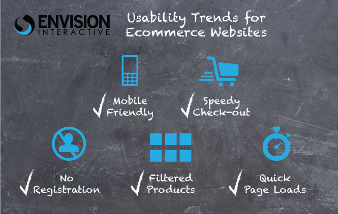
Here are some simple usability improvements you can make to improve sales with your e-commerce site.

1.Get Mobile Friendly
By 2014, more people will be accessing the Internet on portable devices than on traditional desktop computers, according to Gartner. Because of this trend, transaction rates via mobile will significantly increase. Your site must display well on tablet and smart phone screens.
2. Keep Checkout Simple Stupid
It must have a speedy checkout process. Making your customers click through numerous steps will cause shopping cart abandonment before completing their purchase, just as 66% of Internet shoppers did in 2012.
3. Don’t Make Registration Required
It should either not require registration or it should make registration optional. In a recent UX study, Christian Holdst found that few of the highest-earning websites require registration prior to purchase. Registration adds steps to the checkout process and requires information that customers may not be comfortable giving.
4. Why Can’t I Find What I Want?
It should not overwhelm customers with merchandise options that most of them won’t care about. The products featured on the main pages should be filtered so that the best sellers are displayed most prominently. Gilt.com has a team of developers that do precisely this, and their site does extremely well revenue-wise.
5. It Takes Forever to Load
Web users are apt to give up on sites that task their patience. To ensure that your site loads fast, you should check it throughout the day, as it might be slower at some times than others. Your web page host can provide you with information like load speeds and down times. You should check this often to see if there are speed or other usability problems you need to address.
For your e-commerce site to be profitable, it should be as simple and easy to use as possible. One way to measure its usability is to compare it to how mega-sites like Amazon.com performs in each of the five categories above. Watch what the big guys do and learn from them. It may require that you do a lot of tweaking to your site, but the results will be worth the effort.


