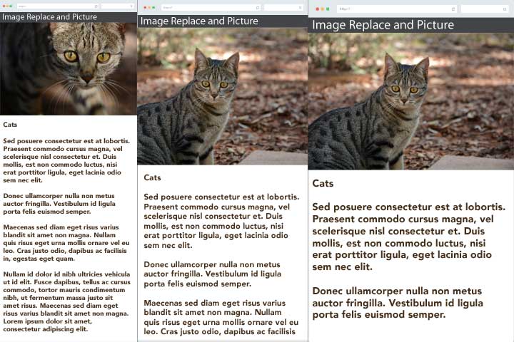
The Picture module is a backport of Drupal 8 Responsive Image module. It allows you to select different images to be loaded for different devices and resolutions using media queries and Drupal’s image styles. You can also use the Image Replace module to specify a different image to load at certain breakpoints.
The Picture module gives you the correct formatting for an HTML5 “
” element and includes a polyfill library for backwards compatibility with unsupported browsers. Unfortunately, this includes IE, Edge, Safari, iOS Safari, and Opera Mini. For more information, Can I Use.
The picture module works great with views. It supports WYSIWYG and creditor. It can be implemented directly with code if necessary.
Installation
Picture has two important dependencies
-
Breakpoints module
-
Ctools module
You can install the Picture module using Drush.
You will also want the Media module and Image Replace module.
Setting Up
Once you have the modules installed and enabled you can start to configure your theme.
1. Set up your breakpoints
You can add breakpoint settings directly in Drupal under Configuration > Media > Breakpoints. Or if you prefer you can add them to the .info file of your theme. We added ours to our theme like this.
breakpoints[xxlarge] = (min-width: 120.063em)
breakpoints[xlarge]  = (min-width: 90.063em) and (max-width: 120em)
breakpoints[large]   = (min-width: 64.063em) and (max-width: 90em)
breakpoints[medium]  = (min-width: 40.063em) and (max-width: 64em)
breakpoints[small]   = (min-width: 0em) and (max-width: 40em)

2. Add Responsive Styles
From within the Drupal UI, you will want to go to Configuration > Media > Breakpoints
-
Click “Add Responsive Style”.
-
Select which breakpoints you want to use for this specific style.
-
Then you will choose an existing image style from the drop-down list that this style will clone.
-
Finally you give it a base name for your new image styles. I would recommend naming it something logical and ending it with “_”.


You can now edit your image styles, you can do your normal scale crop for different sizes or you can setup image replace.
3. Setting up Picture Mappings
Once you have your image styles you have to create a mapping for them to associate with if you go to Configuration > Media > Picture Mappings
-
Click Add to add a new picture mapping
-
Select your breakpoint group.
-
Give your mapping an Administrative title (something you can pick out of a select list)
-
Then you will select “use image style” and select each of the corresponding image styles that you setup from the select list that appears.

Once you have that created you can now select that mapping and use it in different areas of your site. For example, you can use it in the Display of a node using the Manage Display section and formatting it as picture.

You can use it in views by selecting picture format and selecting you picture mapping.

4. Setting up Image Replace
Click edit on your desired image style and as an effect you can add the Replace Image setting. Replace can be combined with other styles as well so if you need to scale and crop you can do that too

Once you have your style setup you need to specify a field to replace with the image with a specific dimensions. We added a secondary field to our structure. We named them with horizontal and vertical because it made sense for us because we only use the vertical field when we are at smaller widths and the content stretches move vertically. You can use whatever naming convention will work best for you.

On the main image that you added to your view or display you edit the field settings and there is a section called Image Replace. Find the image style you set Replace image on and select your field you want to replace your current field.

Finished Product
Once that is done you are all set. If you have any questions or comments be sure to leave your comment in the comments section below.
Here is an example of how we used image replace.


