Khanh Hoang - Kenn
Kenn is a user experience designer and front end developer who enjoys creating beautiful and usable web and mobile experiences.
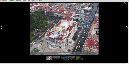
So a client wants a slideshow. No problem! Oh, they want full WYSIWYG for the captions. No problem. What about an option to let a user grab embed code? Easy. It must be responsive, full screen option, attach to nodes, hide and show captions, add branding logo, and make sure you can attach AND embed on the same page. Sure, done deal. Right?

Turns out it was a bit larger of a project than I first expected. After researching various slideshow modules I was unable to find a drop-in solution that fit every requirement, so I decided to go start with the basic Views Slideshow and extend from there. From a previous project I knew that it was possible to make a standard Views Slideshow responsive, and with some jQuery / JavaScript I could make the necessary updates to the styling.
Creating the Content Type
I started out with a new content type using field collections in order to streamline the user interface. With field collections the user would be able to manage all the images from one location. The wrinkle came with the “attach to node” requirement. This was accomplished using a node reference, however this made it much more difficult to use field collections.
After asking around I was pointed towards using the standard one node per slideshow item, but this made management much more difficult and would rely on Nodequeues, or something similar to manage the display order. Thankfully Phil, a very knowledgeable member of our team, suggested Inline Entity Form. If you have not heard of this module, check it out. It is great for content management!

So now I could create a single node to house all the fields for images and WYSIWYG captions, and users could create and attach new slide items from the node edit interface. That still leaves a lot of nodes, but management of each slideshow remains simple.
Once the content type was in place I could begin creating the actual slideshow. The end result was a standard Views Slideshow using jCarousel for the pager, and some custom jQuery for extended functionality. The View had two displays:
1. A Block display that attaches a slideshow to a regular content node via node reference.
2. A Page display that uses a blank template to embed the slideshow without any of the original site theme.
From here it was a matter of custom CSS and jQuery to build out the rest of the functionality.

From a previous project I had learned that with styling updates a regular Views Slideshow could be made responsive. There was one tricky issue that occurs with images any time you want to have them responsive. Do you use the height or the width to 100%? You can't do both, or your image will skew according to the container size. If you choose width 100%, then any portrait type images will become taller than their landscape counterparts, and either get chopped off or bump the page content all over the place. Custom jQuery to the rescue!
After some fiddling around it also became clear that jQuery could apply CSS changes to not only handle the width/height issue, but to create the full window effect and handle simple buttons to show/hide captions. By processing the aspect ratio of each image and comparing it to the average I determined which images should be width: 100%, and which should be height: 100%.
Finally, using the slideshow node ID I was able to create a URL for the Page display of my View, and thus create the iframe embed code for a user to copy. Some small customizations and styling fixes here, some debugging there, and I had a working slideshow!
What customized slideshow have you put together?
