Khanh Hoang - Kenn
Kenn is a user experience designer and front end developer who enjoys creating beautiful and usable web and mobile experiences.
Why Drupal was chosen:
Stanford Law School (SLS) wanted to migrate their unwieldy proprietary legacy CMS called Pentagram to Drupal. The primary reasons for the migration include:
Drupal has become the de facto standard at Stanford, with hundreds of Stanford sites now built on Drupal and more added daily.
The desire to move away from an unsupported legacy CMS that was bulky to update (think CakePHP) to an open-source, scalable, robust CMS that meets their needs now and in the future.
The need for content managers spanning several departments and students to easily add, edit, and manage content and event workflows.
Completed Drupal site or project URL:
Webdrips migrated a database-driven proprietary content management system to Drupal 6. This provided a significantly improved content editor experience, allowing for content to be reused and automated in ways not feasible using the legacy CMS. Event workflows were also a major area of improvement, eliminating some of the clumsy UI issues faced by event content editors.
Describe the project (goals, requirements and outcome):
Goals
The primary goal of this project was to migrate from a legacy CMS to Drupal, including 10,000 pages (mostly) stored in the database, the complex theme, and proprietary code. The secondary goal was to make improvements where possible, especially to the way in which complex page hierarchies were handled. The timeline for the project given the limited resources was 12 to 18 months. Also, with over 300,000 page views and 80,000 unique visitors per month, we wanted to be sure the performance wasn't noticeably diminished.
Requirements
The primary requirements of the site were as follows:
A homepage (see screenshot above) that provided a central hub for the school's latest social activity, such as real-time tweet updates and a carousel view displaying the latest news, events, blogs, and articles.
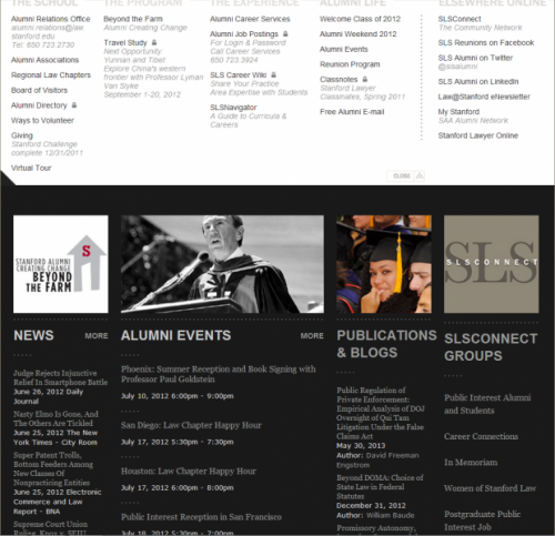
Five information portals (see screenshot below): provided a mega menu with links related to the portal (e.g. alumni), news, events, publications, blogs, and other information related to the portal.
Person and department directory: a filterable, sorted list of all people and departments associated with SLS.
Events section: a searchable, filterable list of events and mini calendar broken down by event type, audience, etc.
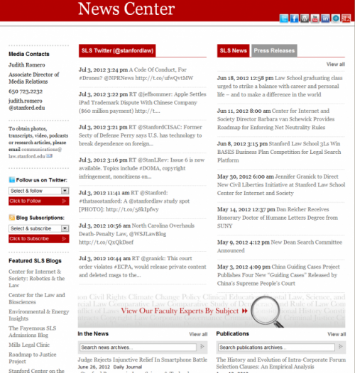
News Center (see screenshot below): a hub for displaying latest tweets, news, press releases, and publications. The page was also a launching point to all of the school's tweeters and bloggers.
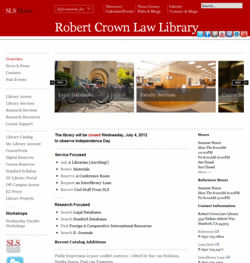
Library section (see screenshot below): a collection of pages, news, events, and other information related to the Robert Crown Law Library.
Complex breadcrumbs: the breadcrumb navigation is used on pages within the site buried several levels deep, and the algorithm for how they're generated became so complex, it wound up requiring over 100 lines of code.
Primary Content (Page) Types
Areas of Interest: SLS has six primary areas of study, so these pages provided a primary description, links to more detailed description by subject within an image carousel, an automated menu with links to related listing pages for faculty, news, departments, publications, events, etc. The primary challenge for this page type was in building the automated menu such that the links to related listing pages were only displayed if the listing page had at least one valid item. For example, we only wanted to show the "News" link if at least one news page had been associated to that area of interest with the proper tag.
Child page: several content types, including areas of interest, needed to have the idea of a page hierarchy. Child pages of any depth needed the option of inheriting a parent's page title, banner, and left/right sidebar content so that content managers needed only edit information in one place. Child pages also needed to be optionally inserted into an automated context navigation menu. The primary challenge with child pages was providing the optional inheritance of one or more parent assets.
Courses: included basic information such as title and description, tagging, related person who taught the course, and the departments the course was related to. Course content is imported from a separate Stanford site using an XML feed.
Events: the most complex page type featured common fields such as title, description, from/to dates, location, related department, and several fields to help the facilities department decide on the best location. Events also included a workflow described in the Modules/Themes section below.
Landing page: a page type targeting students that explain the school, program, and experience. These pages included title, banner, right/left sidebar content, related person quote, and the ability to insert automated content using a view. Providing content managers the capability to insert a view was somewhat challenging in that we needed to generate a list of views, their associated displays, and any optional arguments. This involved writing some custom code because no existing Drupal module provided this capability.
News, publications, and press releases: media page types included basic information such as title, author, date, source, article link, related faculty, and related organization.
Organizations: this page type allowed for creation of office, department, program, and clinic pages. Organizations included location/contact information, left/right sidebar content, relationships to other organizations, etc. Organizations presented two primary challenges: 1) if the content manager chose a particular taxonomy term, the layout needed to be altered to accommodate an image carousel (which was accomplished with the Panels module (see below); 2) If the organization had the proper flag set and at least one news, publication, or press release page related to the organization existed, SLS wanted to display the news/press release/publication in place of the organization's description as the landing page for the organization. In Drupal terms, this implies displaying either the node or a view when the path of the node was accessed.
Person: a page type for adding faculty, staff, and other people to SLS included their name, contact information, photo, CV (résumé) file, biography, awards/honors, education, areas of expertise, and website links.
Outcome
With over 17,000 lines of custom CSS, PHP, and JavaScript code, the project was delivered in the desired time frame, and is a major upgrade over the previous CMS for both content creators and administrators. This site now provides a path to the future that will scale with their needs.
One of the biggest challenges was the lack of a true project manager, so Drupal came to the rescue once again with the Open Atrium project in a box website. If you've never played with Open Atrium before, consider giving it a try. In about four hours, we had a complete project collaboration tool in place. It provides bug tracking by project, a notebook for documentation, a calendar for project events, and a wonderful dashboard to bring it all together.
Team members:


