
Khanh Hoang - Kenn
Kenn is a user experience designer and front end developer who enjoys creating beautiful and usable web and mobile experiences.
Trong hướng dẫn này, chúng ta sẽ tạo ra một đáp ứng khả năng chuyển động mịn màng. Ý tưởng là để có một số bảng nội dung và navigation sẽ cho phép chúng tôi di chuyển giữa các mảng nội dung. Tôi sẽ sử dụng các nút radio để điều hướng và chuyển động nội dung tới vị trí đúng với quá trình chuyển đổi, tạo ra một “di chuyển mượt” có hiệu lực. Ý tưởng này bố trí có thể là hữu ích cho các trang web hoặc các ứng dụng web mà các nội dung cần được chỉnh kích cỡ màn hình (chiều rộng và chiều cao).
Lưu ý rằng đây là, đây chỉ là bản thử nghiệm của tính năng mà tôi demo
<pre>
<div class="st-container">
 <input id="st-control-1" type="radio" checked="checked" name="radio-set" />
 <a href="#st-panel-1">Serendipity</a>

 <input id="st-control-2" type="radio" name="radio-set" />
 <a href="#st-panel-2">Happiness</a>

 <input id="st-control-3" type="radio" name="radio-set" />
 <a href="#st-panel-3">Tranquillity</a>

 <input id="st-control-4" type="radio" name="radio-set" />
 <a href="#st-panel-4">Positivity</a>

 <input id="st-control-5" type="radio" name="radio-set" />
 <a href="#st-panel-5">Passion</a>
<div class="st-scroll"><section class="st-panel" id="st-panel-1">
<div class="st-deco" data-icon="H"></div>
<h2>Serendipity</h2>
Banksy adipisicing eiusmod banh mi sed...</section><section class="st-panel st-color" id="st-panel-2"><!-- ... --></section>
 <!-- ... st-panel-3, st-panel-4, st-panel-5 --></div>
<!-- // st-scroll --></div>
</pre>
<!-- // st-container -->
Chúng tôi sử dụng các liên kết để kết nối navigation đến phần nội dung,ngoài ra nếu nó có tác dụng khá tốt nếu một số trình duyệt không hỗ trợ sử lý js. Các liên kết có giá trị href ID của bảng, chúng ta chỉ đơn giản là sẽ ấn vào radio làm liết kết nhảy vào mảng bên dưới
Bây giờ chúng ta sử lý bố cục cho linh hoạt, phù hợp với kích thước màn hình
.st-container {
    position: absolute;
    width: 100%;
    height: 100%;
    top: 0;
    left: 0;
    font-family: 'Josefin Slab', 'Myriad Pro', Arial, sans-serif;
}
st-container > input,
.st-container > a {
    position: fixed;
    bottom: 0px;
    width: 20%;
    cursor: pointer;
    font-size: 16px;
    height: 34px;
    line-height: 34px;
}

.st-container > input {
    opacity: 0;
    z-index: 1000;
}

.st-container > a {
    z-index: 10;
    font-weight: 700;
    background: #e23a6e;
    color: #fff;
    text-align: center;
    text-shadow: 1px 1px 1px rgba(151,24,64,0.2);
}
.st-container:before {
    content: '';
    position: fixed;
    width: 100%;
    height: 34px;
    background: #e23a6e;
    z-index: 9;
    bottom: 0;
}
Cung cấp vị trí hiển thị
#st-control-1, #st-control-1 + a {
    left: 0;
}

#st-control-2, #st-control-2 + a {
    left: 20%;
}

#st-control-3, #st-control-3 + a {
    left: 40%;
}

#st-control-4, #st-control-4 + a {
    left: 60%;
}

#st-control-5, #st-control-5 + a {
    left: 80%;
}
Biến đổi theo chiều dọc
#st-control-1:checked ~ .st-scroll {
    transform: translateY(0%);
}
#st-control-2:checked ~ .st-scroll {
    transform: translateY(-100%);
}
#st-control-3:checked ~ .st-scroll {
    transform: translateY(-200%);
}
#st-control-4:checked ~ .st-scroll {
    transform: translateY(-300%);
}
#st-control-5:checked ~ .st-scroll {
    transform: translateY(-400%);
}
Chuyển động animate CSS3
#st-control-1:checked ~ .st-scroll #st-panel-1 h2,
#st-control-2:checked ~ .st-scroll #st-panel-2 h2,
#st-control-3:checked ~ .st-scroll #st-panel-3 h2,
#st-control-4:checked ~ .st-scroll #st-panel-4 h2,
#st-control-5:checked ~ .st-scroll #st-panel-5 h2{
    animation: moveDown 0.6s ease-in-out 0.2s backwards;
}

@keyframes moveDown{
    0% {
        transform: translateY(-40px);
        opacity: 0;
    }
    100% {
        transform: translateY(0px);
        opacity: 1;
    }
}
Đối với kiểu màn hình hiển thị cỡ chữ khác nhau
@media screen and (max-width: 520px) {
    .st-panel h2 {
        font-size: 42px;
    }

    .st-panel p {
        width: 90%;
        left: 5%;
        margin-top: 0;
    }

    .st-container > a {
        font-size: 13px;
    }
}

@media screen and (max-width: 360px) {
    .st-container > a {
        font-size: 10px;
    }

    .st-deco{
        width: 120px;
        height: 120px;
        margin-left: -60px;
    }

    [data-icon]:after {
        font-size: 60px;
        transform: rotate(-45deg) translateY(15%);
    }
}
Và đó điều cơ bản của chuyển động này! Tôi hy vọng bạn thích phần hướng dẫn này và có thể từ đây truyền cảm hứng sáng tác cho mỗi bạn!

Kenn is a user experience designer and front end developer who enjoys creating beautiful and usable web and mobile experiences.


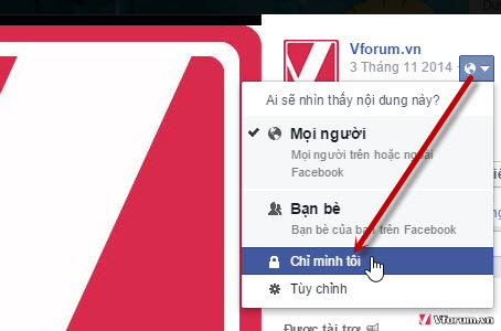
Để người khác không thể xem được ảnh đại diện facebook của bạn thì một cách
Theo các nhà nghiên cứu của Strategy Analytics, trong quý 3 vừa qua, iPhone 5 đã giúp Apple giành thêm 11% thị phần thiết bị 4G LTE, và đưa công ty này vươn lên thành nhà sản xuất thiết bị 4G LTE lớn thứ 2 thế giới.
The Open Atrium Workbench module, along with several dependent modules, was a collaboration between Phase2 (srjosh and myself) and the Community (dsnopek).


")


