Khanh Hoang - Kenn
Kenn is a user experience designer and front end developer who enjoys creating beautiful and usable web and mobile experiences.
>>Phần 3 tạo Images responsive của Responsive Theme trong Drupal 7
The objective of this section is to make the primary menu a toggle menu for the mobile interface. i.e the menu renders on click in mobile devices and is horizontal on screens wider than 600px.

1) Understand how your menu works at different breakpoints.
2) Print the main navigation menu on your page.tpl.php
<?php if ($main_menu): ?/>
<nav id="main-menu" class="navigation"/>
<?php print theme('links__system_main_menu', array(
'links' => $main_menu,
'attributes' => array(
'id' => 'main-menu-links',
'class' => array('links', 'clearfix'),
),
'heading' => array(
'text' => t('Main menu'),
'level' => 'h2',
'class' => array('element-invisible'),
),
)); ?>
</nav/>
3) Print the mobile menu icon right above the primary menu
<!-- /#mobile toggle --/>
<div id="main-menu-mobile"/> <a href="#"/>
<img src="<?php print base_path() . drupal_get_path('theme', 'robosmart') . '/images/main-menu-mobile.png' ?>" </a></div>
4) Based on how the menu needs to be displayed for a mobile, add styles to style.css. The default style is the mobile style.
#main-menu ul{
padding: 0 8px;
}
#main-menu ul li{
font-family: temporarium italic;
font-size: 1.417em;
font-style: italic;
margin: 0;
padding: 0;
border-bottom: 1px solid #999;
}
#main-menu ul li.last{
border: none;
}
#main-menu ul li a{
color: #000;
padding: 5px 10px;
display: block;
background: url(../images/main-menu-arrow.png) no-repeat 98% center;
}
5) Based on how the menu responds and the breakpoint at which the menu changes, add the style for larger devices in the appropriate style sheets. In our case the style is written in style-600.css. Note here we hide the #main-menu-mobile image. The toggle menu icon is visible only for the mobile view. Verify style-600.css is associated with the appropriate breakpoint/media query in the info file of your theme.
#main-menu-mobile{
background: #c7c7c6;
padding: 8px 5px;
border-radius: 3px;
-webkit-border-radius: 3px;
-moz-border-radius: 3px;
margin: 7px;
width: 21px;
height: 13px;
position: absolute;
top: 0;
right: 0;
}

#main-menu-mobile, #main-menu.menu-visible{
display: block;
}
6) Now for the action! Add the below js file to your theme to make your menu toggle
jQuery(document).ready(function($) {
if ($('#main-menu-mobile img').length > 0) {
$('#main-menu-mobile img').click(function() {
$('#main-menu').toggleClass("menu-visible");
return false;
});
}
});
I didn't know building a toggle menu was this simple until I actually did it!

Kenn is a user experience designer and front end developer who enjoys creating beautiful and usable web and mobile experiences.


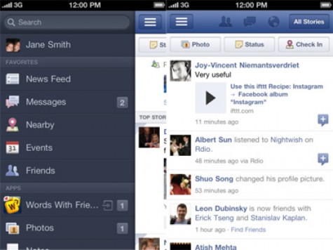
Không cần phải nói nhiều về Facebook – mạng xã hội lớn nhất thế giới hiện nay – với sức ảnh hưởng sâu rộng của nó. Theo ý kiến chủ quan của Việt Coding
Trang All Things D khẳng định cách đây một năm rưỡi, Facebook thành lập một nhóm chuyên trách, làm việc tại một văn phòng ngoài trụ sở công ty và chỉ những người có liên quan mới được vào trong.
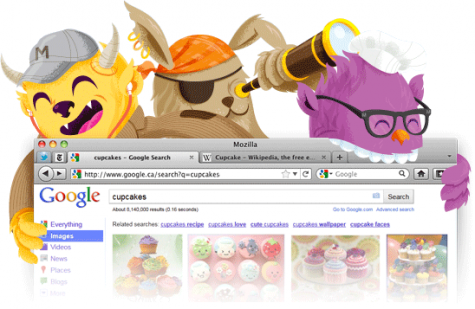
Mozilla đã tung ra phiên bản ổn định của trình duyệt Firefox 8 vào hôm qua, ngày 8/11. Nhiều tính năng mới đã được thêm vào như tích hợp tìm kiếm trong Twitter...


")


