Khanh Hoang - Kenn
Kenn is a user experience designer and front end developer who enjoys creating beautiful and usable web and mobile experiences.
>>Phần 3 tạo Images responsive của Responsive Theme trong Drupal 7
The objective of this section is to make the primary menu a toggle menu for the mobile interface. i.e the menu renders on click in mobile devices and is horizontal on screens wider than 600px.

1) Understand how your menu works at different breakpoints.
2) Print the main navigation menu on your page.tpl.php
<?php if ($main_menu): ?/>
<nav id="main-menu" class="navigation"/>
<?php print theme('links__system_main_menu', array(
'links' => $main_menu,
'attributes' => array(
'id' => 'main-menu-links',
'class' => array('links', 'clearfix'),
),
'heading' => array(
'text' => t('Main menu'),
'level' => 'h2',
'class' => array('element-invisible'),
),
)); ?>
</nav/>
3) Print the mobile menu icon right above the primary menu
<!-- /#mobile toggle --/>
<div id="main-menu-mobile"/> <a href="#"/>
<img src="<?php print base_path() . drupal_get_path('theme', 'robosmart') . '/images/main-menu-mobile.png' ?>" </a></div>
4) Based on how the menu needs to be displayed for a mobile, add styles to style.css. The default style is the mobile style.
#main-menu ul{
padding: 0 8px;
}
#main-menu ul li{
font-family: temporarium italic;
font-size: 1.417em;
font-style: italic;
margin: 0;
padding: 0;
border-bottom: 1px solid #999;
}
#main-menu ul li.last{
border: none;
}
#main-menu ul li a{
color: #000;
padding: 5px 10px;
display: block;
background: url(../images/main-menu-arrow.png) no-repeat 98% center;
}
5) Based on how the menu responds and the breakpoint at which the menu changes, add the style for larger devices in the appropriate style sheets. In our case the style is written in style-600.css. Note here we hide the #main-menu-mobile image. The toggle menu icon is visible only for the mobile view. Verify style-600.css is associated with the appropriate breakpoint/media query in the info file of your theme.
#main-menu-mobile{
background: #c7c7c6;
padding: 8px 5px;
border-radius: 3px;
-webkit-border-radius: 3px;
-moz-border-radius: 3px;
margin: 7px;
width: 21px;
height: 13px;
position: absolute;
top: 0;
right: 0;
}

#main-menu-mobile, #main-menu.menu-visible{
display: block;
}
6) Now for the action! Add the below js file to your theme to make your menu toggle
jQuery(document).ready(function($) {
if ($('#main-menu-mobile img').length > 0) {
$('#main-menu-mobile img').click(function() {
$('#main-menu').toggleClass("menu-visible");
return false;
});
}
});
I didn't know building a toggle menu was this simple until I actually did it!

Kenn is a user experience designer and front end developer who enjoys creating beautiful and usable web and mobile experiences.


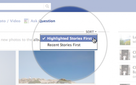
Trong một bài viết vào chiều ngày 9/11, Facebook cho biết họ vừa tung ra một bản cập nhật cho News Feed. Theo đó, người dùng có thể sắp xếp thông tin theo những câu chuyện gần đây (Recent Stories) hay câu chuyện nổi bật (Highlighted Stories).
Ảnh hưởng của tìm kiếm toàn cục và tùy biến tới kết quả tìm kiếm và tối ưu hóa tìm kiếm theo địa lý, tìm kiếm video và tìm kiếm hình ảnh.
Mobile, Mobile, Mobile : 2014 : Dùng Mobile duyệt web nhiều hơn cả máy để bàn.


")


")


