
Khanh Hoang - Kenn
Kenn is a user experience designer and front end developer who enjoys creating beautiful and usable web and mobile experiences.
A very elementary question, how does anyone access our website? it’s either by typing our website address or by clicking a link. Links to our website could be through Search, Social Media or Email campaigns. Increasingly these links can be accessed through various devices. How do we have a website that is supported in these multiple devices? Do we build separate websites or applications for each of these devices? Is there a development strategy that we need to adopt that could give us a more unified approach?
Yes with the advent of Responsive design approach we could build a single website that adapts to different devices. Responsive Web design helps us build a website that responds to the device from which the user accesses it. Two terminologies that go hand in hand with Responsive design are the Mobile first approach and Progressive Enhancement.
The methodology of loading what is essential for mobile user as default is “mobile first approach”. This ensures that the mobile user has optimized content and not burdened with the large content of the web. The design not only caters to the constraints of a mobile device and user behaviour but utilizes the capabilities of the device.
1. The space available to display content is extremely small, the design needs to work on smaller screen sizes.
2. The user is usually accessing information in low bandwidth or is in urgent need of the content, the design needs to be performance optimized.
In the mobile information can be accessed anytime and at anyplace. Understanding when and how information is accessed defines the behaviour of the audience.
Some of the key capabilities of a device include Location detection, Device accelerometer, Touch, Camera and Ambient light. These are device-specific feature and should therefore be kept independent of the design.
Progressive enhancement ensures that the content and functionality are accessible in the least capable device. There is minimum use of markup. The layout enhances itself in
the end user’s device capabilities are respected. This goes hand in hand with the philosophy of separating content and markup. Also the default version is always the simplest version.
Did you know? The mobile initiative for Drupal 8 is dedicated to provide a responsive Drupal. The themes that ship with Drupal will be responsive, the administrative interface will be responsive.
My favourite Responsive sites
Adjust the browser, slowly make it more thinner than wider, see the sites respond.

Kenn is a user experience designer and front end developer who enjoys creating beautiful and usable web and mobile experiences.


Bất kỳ công ty nào hoạt động tại Đức đều sẽ phải tuân theo bộ luật của đất nước này - ủy ban luật pháp tại Hamburg, Đức phán quyết
YouTube, Vimeo and other video hosts makes it easy to embed their players in your own website.
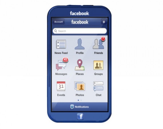
Có vẻ như Facebook đã rất “máu” với cuộc chơi mới trên thị trường smartphone bằng cách tự mình thiết kế và sản xuất một mẫu điện thoại mang thương hiệu Facebook...


")


.")
