Welcome to the second installment of an 8-part blog series we're calling "The Ultimate Guide to Drupal 8." Whether you're a site builder, module or theme developer, or simply an end-user of a Drupal website, Drupal 8 has tons in store for you! This blog series will attempt to enumerate the major changes in Drupal 8. Successive posts will gradually get more technical, so feel free to skip to later parts (once they're published) if you're more on the geeky side.
Please note that since Drupal 8 is still under active development, some of the details below may change prior to its release. Still, since Drupal 8 is now feature-frozen, hopefully most info should remain relevant. Where applicable, Drupal 7 contrib equivalents of Drupal 8 features will be noted.
Mobile Improvements
In addition to authoring experience improvements, another huge area of focus for end-users of Drupal websites is on features that make Drupal 8 more mobile-friendly out of the box, to keep up with trends showing a global explosion of mobile devices worldwide.
Mobile First
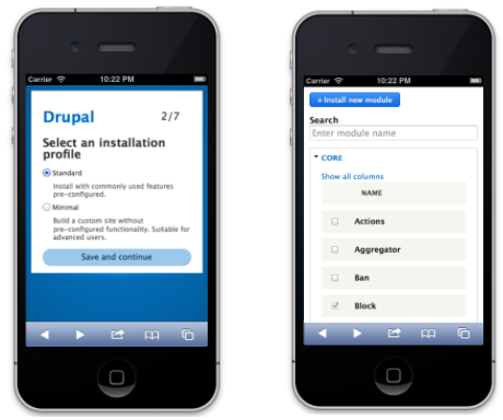
You'll find that everything in Drupal 8 has been designed with mobile in mind, from the installer to the modules page. Even new features such as in-place editing are designed to work on teensy screens. Give Drupal 8 a try in your device of choice, and let us know where you find bugs! (Uhhh, if. Right, I meant if you find bugs. ;))

(Also, why yes, that is a search box on the modules page! Woohoo! :D Check out Module Filter for a similar experience in Drupal 7.)
Responsive-ize ALL the things (themes, images, tables…)
In order to support the unimaginable array of wacky Internet-enabled devices coming down the line in the next 5+ years, Drupal 8 incorporates responsive design into everything it does.
For starters, all core themes are now responsive, and automatically reflow elements like menus and blocks to fit well on mobile devices (if the viewport is too narrow, horizontal elements will switch to a vertical orientation instead). There's also built-in support for responsive images, so that images that show up large on a desktop shrink down to fit on a tablet or smartphone.

Drupal 8 also provides support for responsive tables, so table columns can be declared with a "high, medium, low" importance. On wide screens, all of the columns show up, but as the screen size narrows, the less important columns start dropping off so everything fits nicely. This API is also built into Views module, so you can configure your own responsive admin screens.

Responsive Bartik and Responsive Tables module can do a similar thing for Drupal 7. There are also numerous responsive base themes for Drupal 7 including Omega and Zen, from which you can build a responsive design for your website.
Mobile-friendly toolbar
Drupal 8 also now sports a shiny new administrative toolbar that automatically expands and orients itself horizontally on wide screens, and collapses down to icons and orients vertically for smaller screens. Like all new front-end features in Drupal 8, this one also got tons of accessibility love, so it's easy for screen reader users to jump around to various parts of the site.

If you're interested in this feature for Drupal 7, check out the Mobile Friendly Navigation Toolbar module.
Responsive preview
Though it remains to be seen if this feature will end up as part of Drupal 8 core or not, the Responsive Preview module (available for Drupal 7) provides an easy, CMS-integrated way to quickly check what your site approximately looks like in various different, customizable, form-factors without having to spend $25,000 in hardware. ;) You can flip easily between landscape and portrait mode, as well.


Front-end performance
One of the biggest factors that can make or break the mobile experience is the raw performance of a website. As a result, lots of work has been done in Drupal 8 to minimize its front-end footprint. For example, in many cases, jQuery was swapped out for native JavaScript, and out of the box Drupal 8 loads zero JavaScript files for anonymous visitors. Additionally, JS-intensive features such as the Overlay module have been removed in favour of lighter-weight alternatives that are mobile friendly. (A simple "Back to site" link in the admin toolbar visible while in an administrative context; see Escape Admin for a Drupal 7 equivalent.)

Whew! That's a wrap!
Join us next week, when we'll talk about all the nifty site builder improvements coming to Drupal 8!


